
Laying out a Word document
Design considerations when laying out a document

There are several considerations when laying out a document - the cover & back cover layout, margins, headers & footers and "white space".
If your document needs a cover, ask yourself, "What are the minimum requirements for cover content?" the cover should be your attention grabber and as such should be very simple. It should have one main photo (two at the most), a one line title, with a one or two line subtitle.
Pick a photo that visually tells the "Big Idea" of the document and a subtitle that supports the title by explaining the title in a descriptive way. It is basically an expanded description of the title.
The back cover is the last word of the document. Is there something that should be said as a "last word". It is also an ideal place to put your logo and contact details.
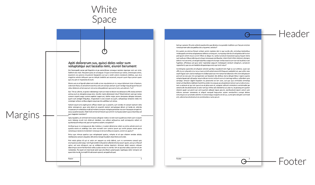
If you are intending on using two columns then your left and right margins should be smaller than if you are using one column. A rule of thumb is to make sure that the number of characters to a column is max 50 to 65. For two columns it is less. The reason for this is so it is easy for the eye to read from the end of one line to the beginning of the next.
Don't be scared to use 30 - 40mm left and right / outside and inside margins when you are using one columns and as small as 10mm when using two columns.
White space is what graphic designers call the space before chapters, around photos and anywhere that you need solid colour or lack of colour to move the eye across the layout. Clever use of "white space" can focus the readers eye on a place in a layout, such as the beginning of a chapter. Don't be scared to use white space; you don't have to fill your whole page will text and photos.
Last but certainly not least, headers and footers help to define each section or chapter and can be used to hold information that is duplicated across each page such as a logo, address, chapter information, dates and page numbers.
Headers and footers can also add a bit of zest to the document. you can use a header with a photo or colour to define each new section or chapter. Footers are a lot simpler but can still be a little colourful.
Ok, this is the first step towards a better designed document. Set up your layout first and make sure you are happy with it before you do anything else.